lost affinity—
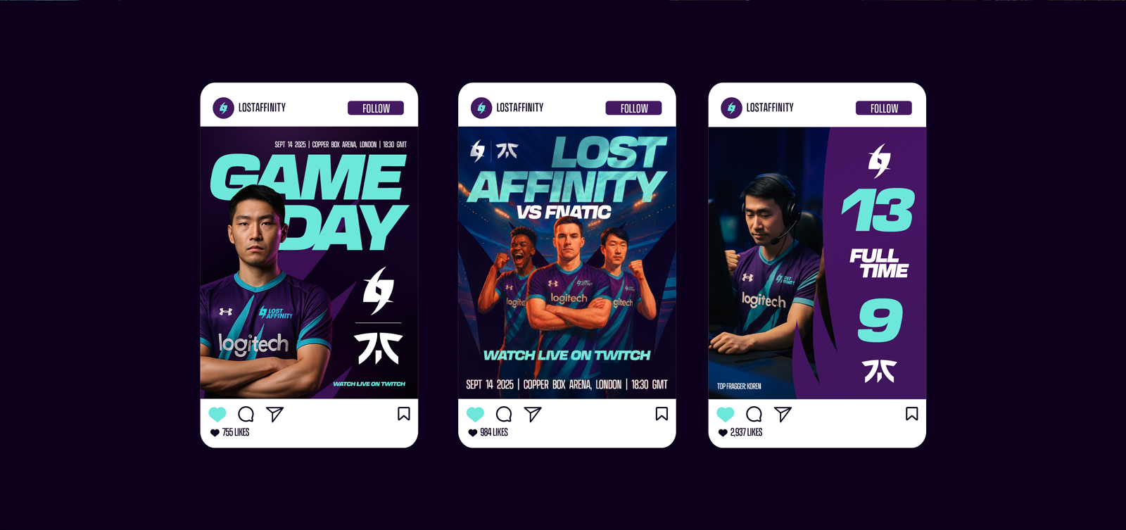
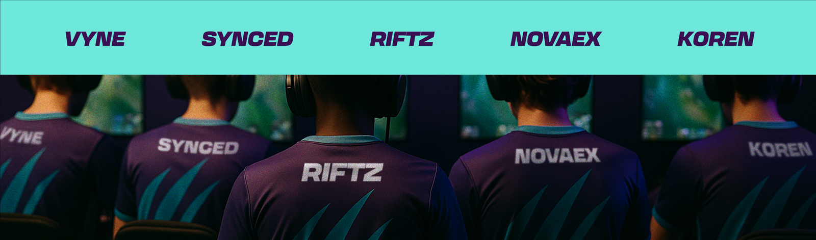
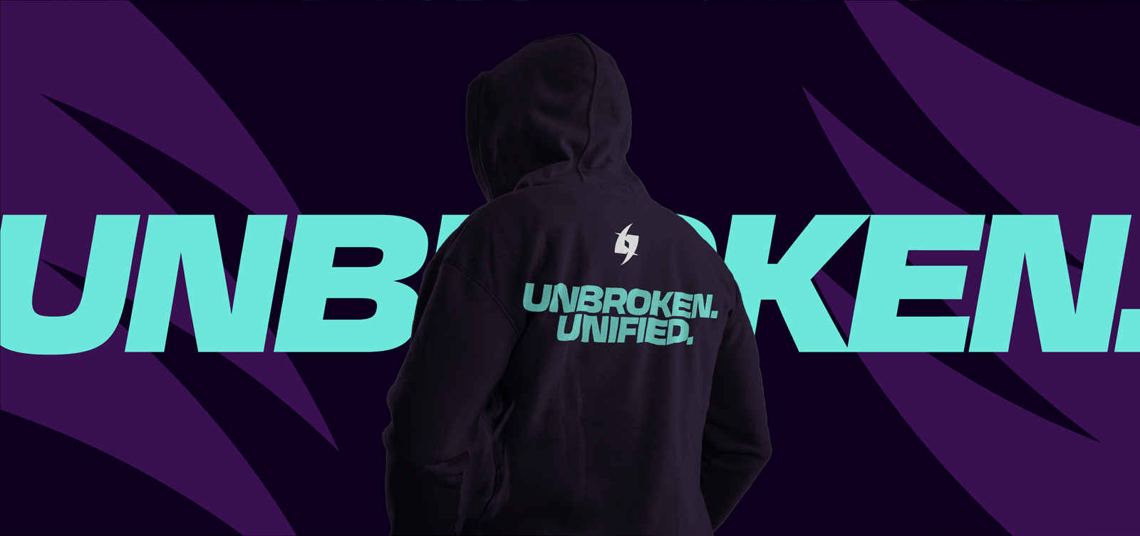
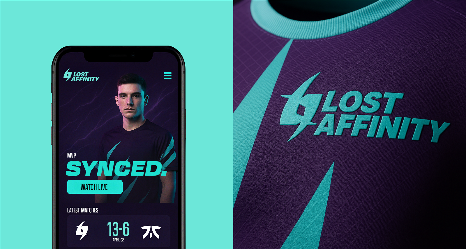
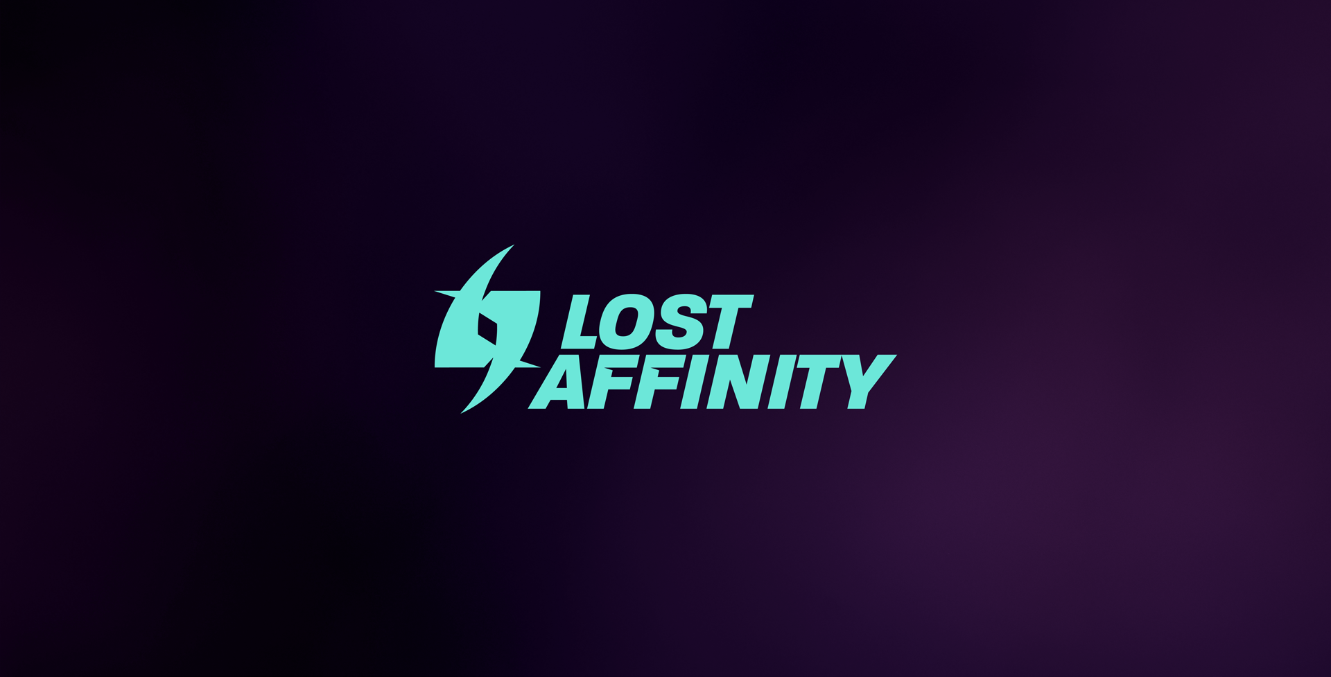
Lost Affinity was built for the lone wolves who found their pack, and we gave them a brand to match. Something sharp, tight, and built for the world they live in: screens, streams, scrims, and high-stakes gameplay. The identity centres around a logo that moves like a signal—clean, fast, and strong under pressure—backed by a punchy purple and cyan palette that cuts through the noise in a space full of red and black.
We designed a type system that’s flexible but disciplined, bold where it needs to be, slick where it counts. From matchday templates to MVP cards and recap graphics, everything slots into a system that feels deliberate, cohesive, and ready to scale. And the tone? Understated confidence. No ego, no bravado, just synced-up energy and squad-first thinking.
From solo queue to tournament-ready, Lost Affinity now looks like a team with presence. One you want to watch, and one you want to win.
—BranDING